When Sally Beauty's executive team commissioned a third-party marketing agency to completely overhaul their branding, I was tasked with integrating an entirely new visual aesthetic into our existing design system. A major lift involved updating the Product Detail Pages (PDPs), one of the most critical parts of an e-commerce website, without sacrificing usability or conversion performance.
![]()
The executive decision to completely overhaul the Sally Beauty website was not just an aesthetic choice but part of a larger brand strategy to reposition itself in an increasingly competitive beauty retail market. However, this created a potential business risk: product detail pages generate the majority of e-commerce conversions, and any disruption could significantly impact revenue. We couldn't afford to simply apply new branding without addressing fundamental usability concerns.
The third-party redesign delivered a dramatically different look, clearly developed by a graphic design team whose primary concern was aesthetics. Implementing this new look would require careful consideration of:
Our stakeholders on the e-commerce and analytics teams had raised concerns about site performance issues the product team needed to tackle in the new fiscal year. Rather than simply giving the PDPs a facelift, our UX team recognized this as an excellent opportunity to identify as many areas of improvement as possible and tackle them in one initiative.
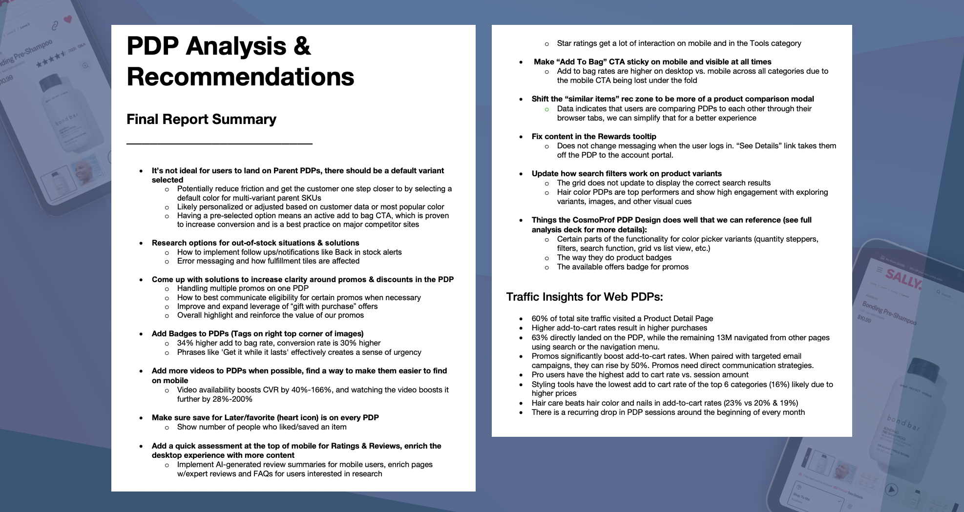
The UX team conducted a thorough assessment comparing the marketing agency's wireframes to our existing site, identifying several key areas for improvement:
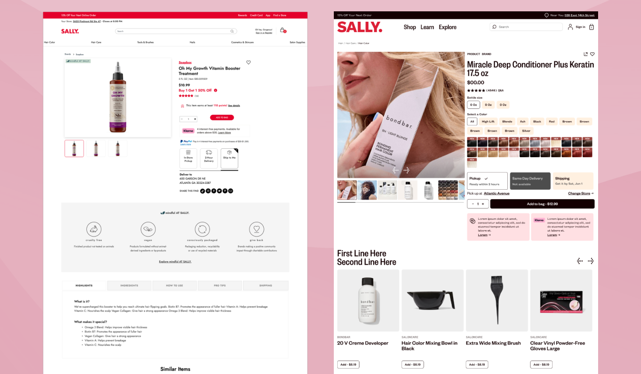
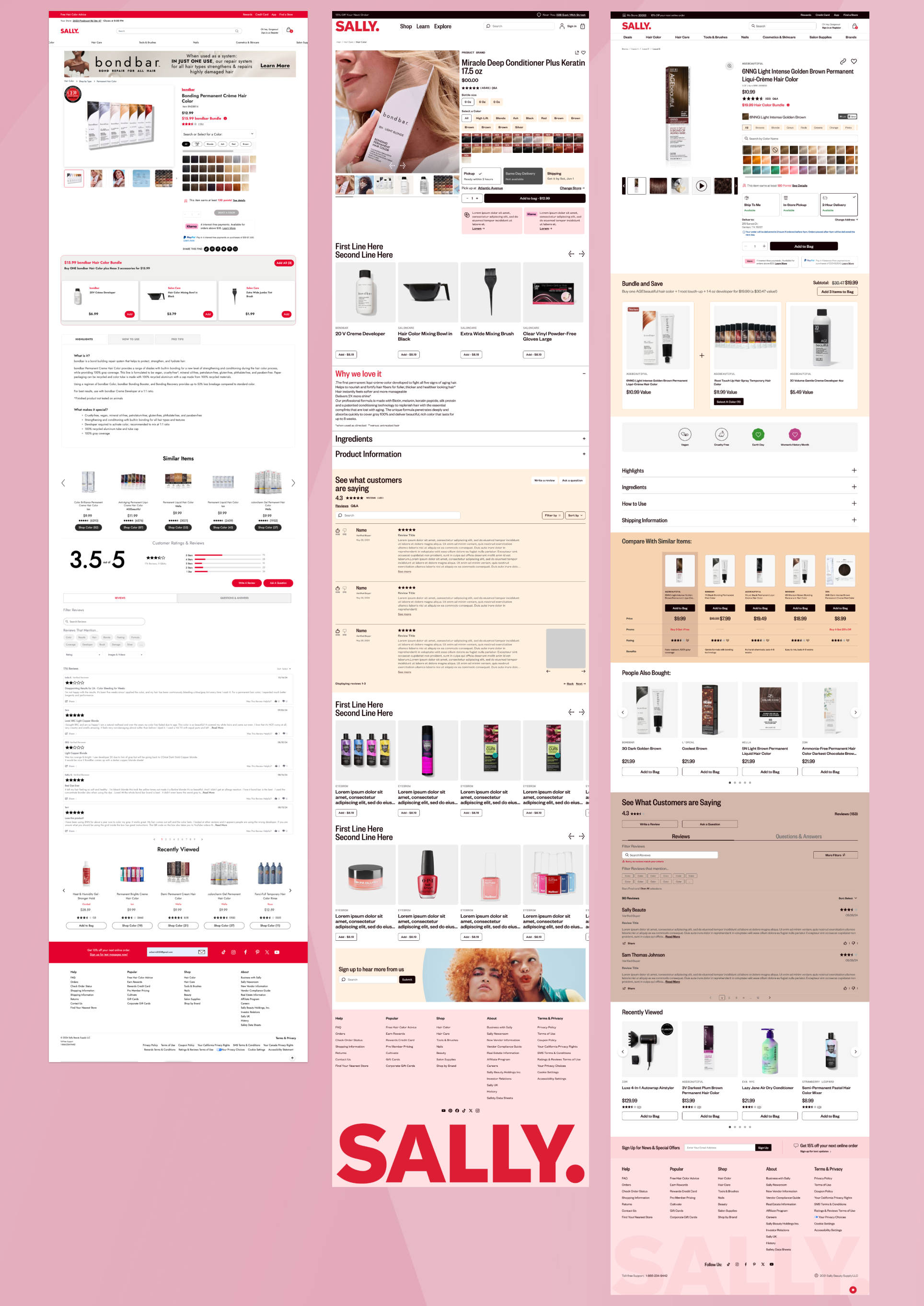
Meanwhile, our junior designer conducted comprehensive competitor research to benchmark our current PDPs against industry standards, revealing opportunities to improve our adherence to best practices.
I extracted insights from several months of e-commerce and analytics research decks to identify specific customer pain points on our existing PDPs. This data became crucial for justifying design decisions and ensuring our rebrand addressed real user needs rather than just aesthetic preferences.
With a robust library of existing page templates and UI assets, we conducted a comprehensive audit to determine:
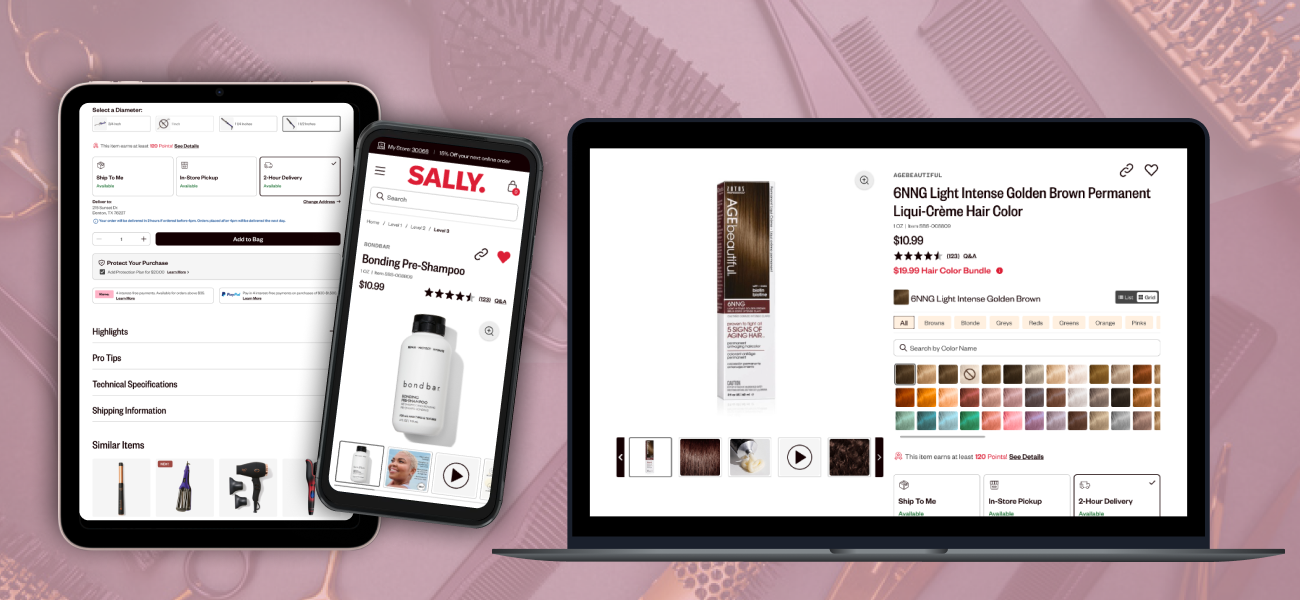
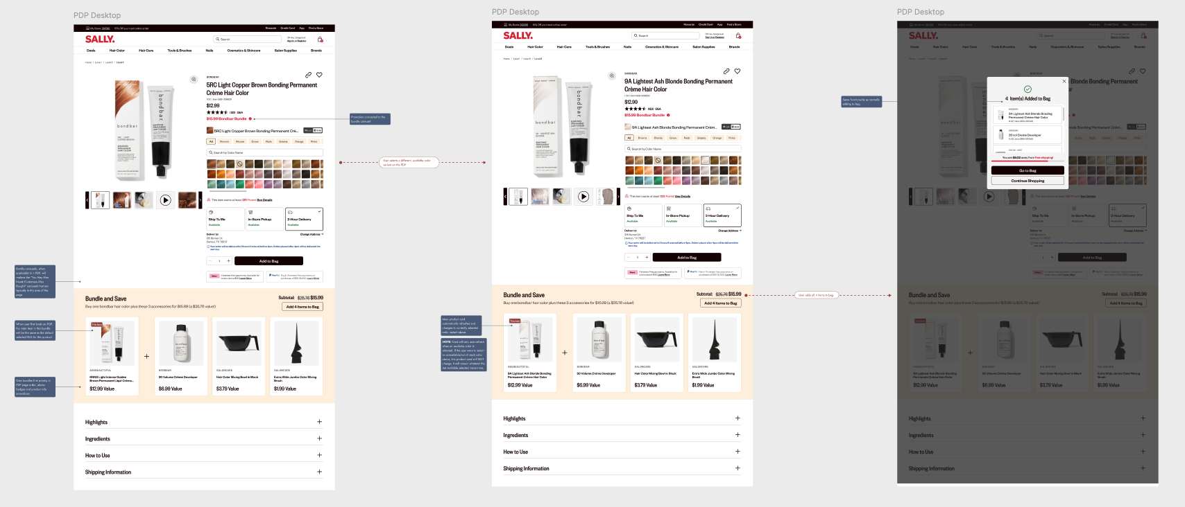
Given the complexity of updating multiple PDP variants while maintaining an active e-commerce site, we found it helpful to break down the project into focused sprints targeting general sections of the PDP anatomy, then further into more specialized components within those sections. This approach allowed us to prioritize efficiently while ensuring thorough attention to each page variant's unique requirements.
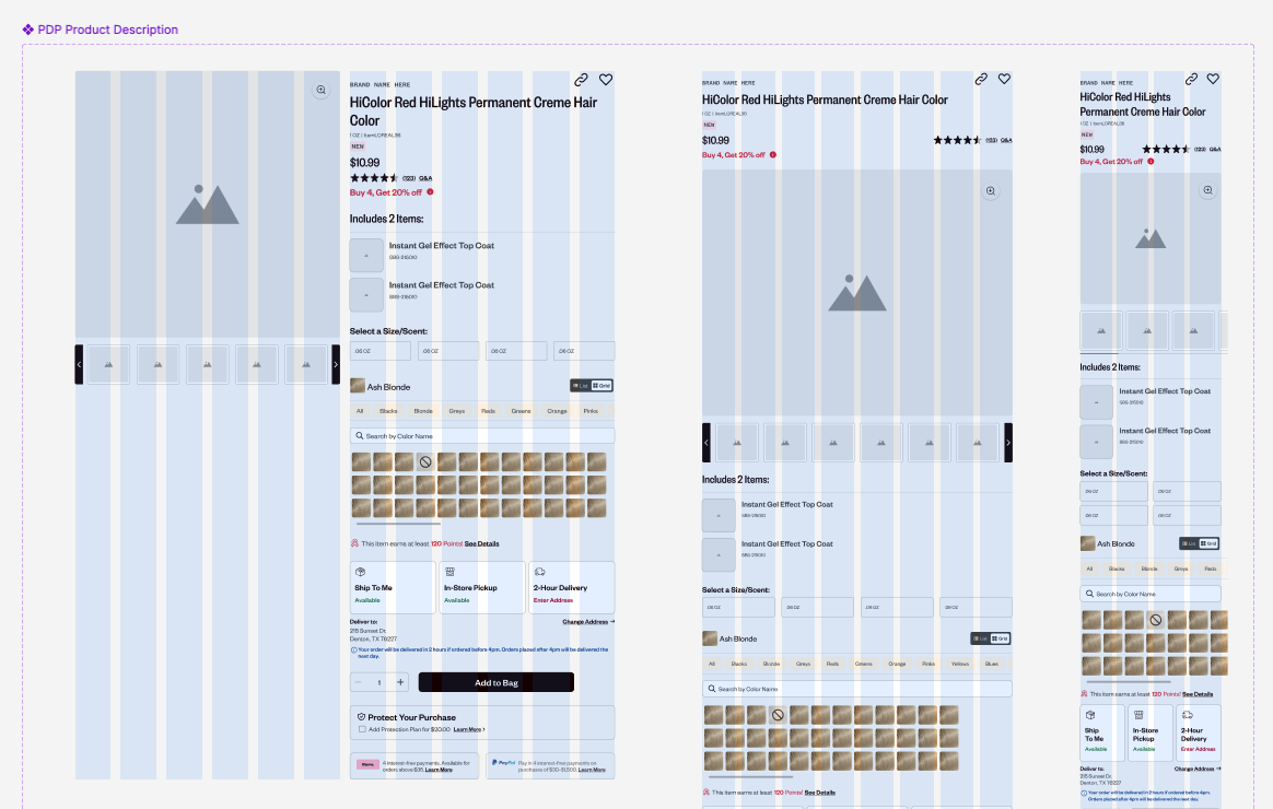
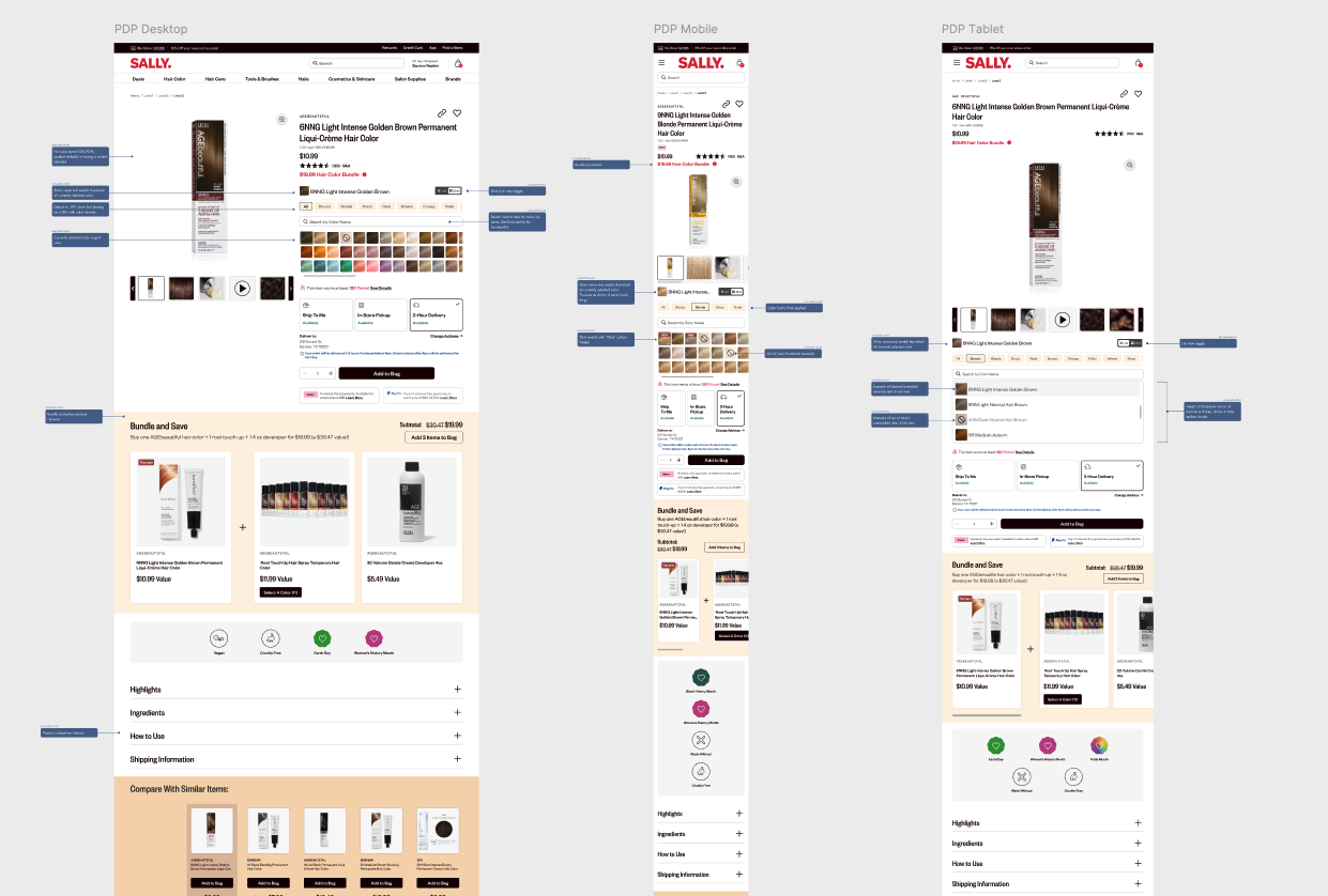
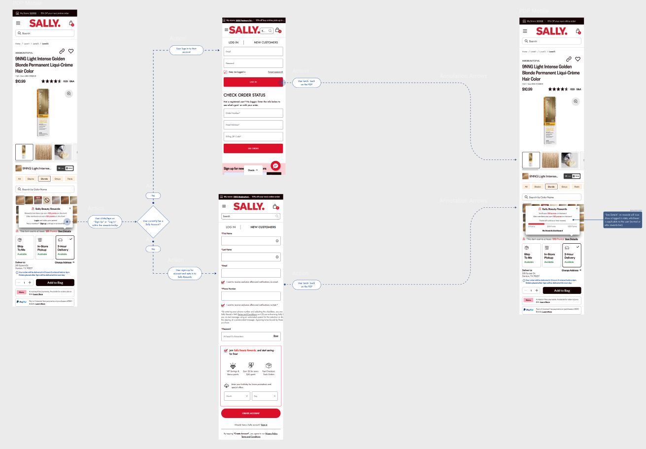
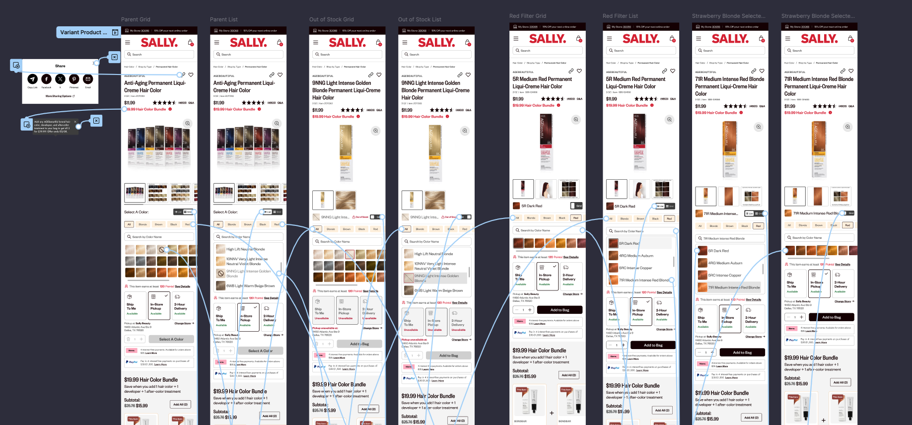
I created high-fidelity wireframes for all PDP variants, ensuring each template included detailed interaction flows to demonstrate functionality and guide development implementation:
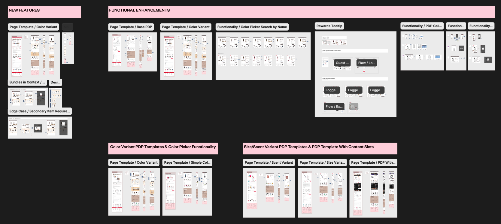
Additionally, there were conditional scenarios that required their own separate tickets but were still considered part of the larger PDP initiative:
Since we wanted to validate multiple aspects of the redesign, I planned a comprehensive testing strategy across project phases:
Initial survey-based testing evaluated how users interpreted the new iconography and color schemes from the marketing rebrand. This helped us identify which aesthetic elements caused confusion and needed modification.
We tested interactive prototypes of two key variants to cover the most important functions:
Special focus on bundle promotion functionality, which e-commerce frequently uses but had historically caused user confusion. Testing revealed different use cases and informed clearer communication strategies.
Our optimized designs tested positively across all variants, requiring only minor refinements. The testing validated our approach of preserving proven UX patterns while updating the visual design, and confirmed that our improvements to promotional clarity would reduce customer confusion.
Development implemented PDP updates incrementally, allowing for A/B testing of individual components. This approach minimized risk while providing data on each enhancement's impact.
The project resulted in a significantly enhanced design system that:
This project taught me how to effectively advocate for user experience within brand-driven initiatives. By using data to justify design decisions, I was able to push back on aesthetic choices that would have compromised usability while still achieving the marketing team's brand goals. The key was framing UX recommendations in terms of business impact rather than design preferences.
Successfully coordinating between marketing's brand vision, e-commerce's performance needs, analytics' data insights, and development's technical constraints required careful communication and prioritization. I learned to create alignment by focusing everyone on shared goals—improved conversion rates and better customer experience—rather than getting caught up in individual department priorities.
Breaking a massive rebrand project into focused component sprints proved essential for maintaining quality while meeting aggressive timelines. This approach allowed deep focus on each element's unique requirements while ensuring the overall experience remained cohesive. It also enabled better risk management through incremental testing and rollout.
Using existing analytics and research to support design decisions proved crucial when integrating third-party brand designs. By grounding UX recommendations in performance data and user research, I could advocate for necessary changes while demonstrating respect for the brand investment and executive decision-making.
The enhanced PDP templates became the foundation for Sally Beauty's post-rebrand e-commerce experience, providing:
The PDP enhancement project showcased how strategic UX thinking can transform a potentially disruptive brand mandate into an opportunity for comprehensive user experience improvement, resulting in measurable business impact and a stronger design foundation for future growth.